")
")
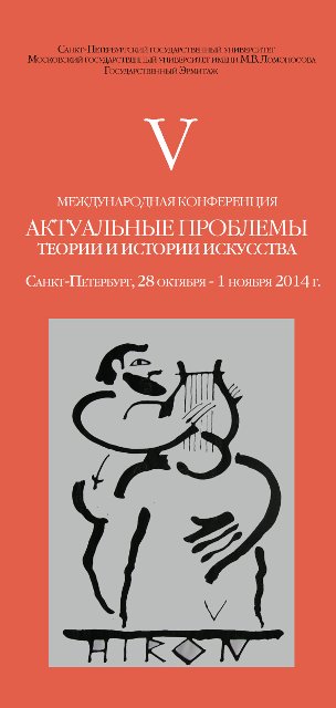
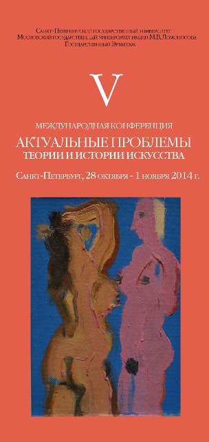
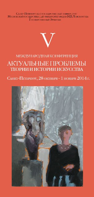
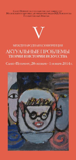
It has become a tradition to choose a contemporary artwork as a symbol of our conference. The decision of which work would appear on catalogues and all hand-out materials is made by the organising committee every year. In 2014 it was decided to set up an online gallery of works of artists, whose paintings had been chosen as emblems for the last four conferences. These works are represented below and are followed by reviews written by artists or art critics.
We would like to invite artists, who share the idea and aims of our conference, to participate and add their works to our online collection. To become a part of it send us an email to info@actual-art.org with your works in jpg/tiff format and put “online gallery” as the subject.
This project does not have a commercial background, but it aims to develop a wider interaction between participants of the conference and contemporary artists.
2022
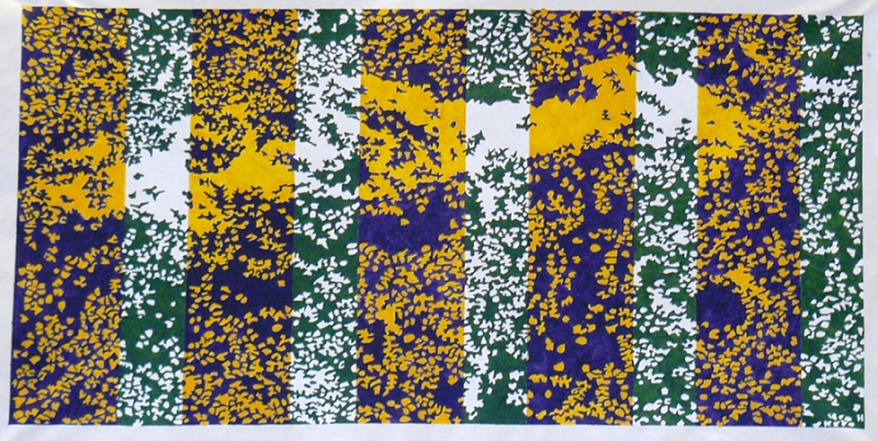
‘@Evgenia Popova’ (2022) by Evgenia Buravleva has been chosen as the emblem of 2022 conference.
2020
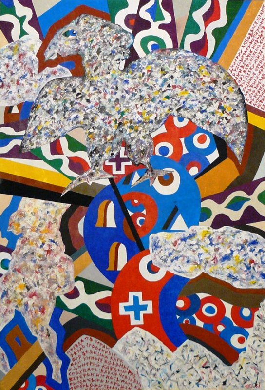
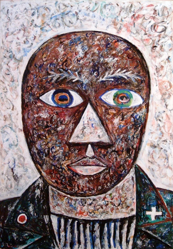
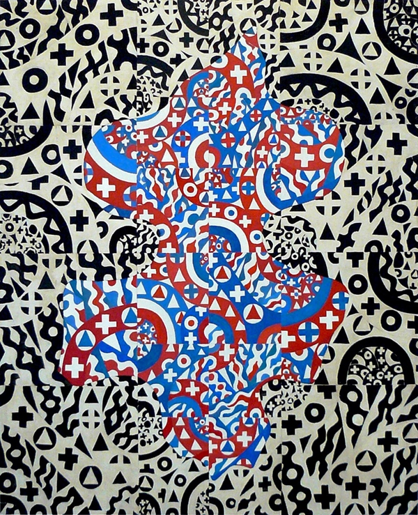
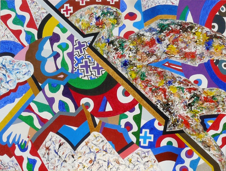
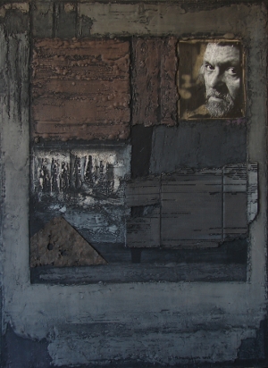
‘Process’ (2019) by Vitaly Pushnitsky, has been chosen as the emblem of 2020 conference.
 by Vitaly Pushnitsky")
Vitaly Pushnitsky
Born in 1967 in Leningrad, USSR. In 1994 graduated from the Department of Grafics, Repin Painting Institute of Painting, Sculpture and Architecture; since 1994 is a member of Saint-Petersburg Union of Artists. He is known as a painter, sculptor, graphic artist, a creator of installations, widely experimenting across different art forms. He participated multiple high-status Russian and international projects and exhibitions, including MANIFESTA 10 (2014) and 56th Venice Biennale (2015). Pushnitsky’s personal exhibitions took place at the State Hermitage Museum (2006), the State Russian Museum (2002), and the Moscow Museum of Modern Art (2012). Nominated for the Kandinsky Prize (2008-2012); won the Sergey Kuryokhin Award for Contemporary Art (2012). In 2011 the British publisher of art Phaidon Press included Vitaly Pushnitsky in the list of 115 artists defining new perspectives in art.
Art critics about Vitaly Pushnitsky
Stanislav Savitsky:
The visual story unfolds like an organic ornament growing on top of the layer of paint on the surface of the canvas. Oil is the bonding principle that binds the primed canvas with ribbons cut from canvas, woven into a complex floral pattern.
<…>
Painting, therefore, turns out not to be a narrative of colors, but a story of canvas on canvas, where oil complements and accentuates this story composed of collage elements molded into a striking relief. Artistic experience finds itself on the border of a one-dimensional illusion of a three-dimensional image, sculpture and visual combinatorics, opening up space to a new artistic freedom and eliminating any differences between figurative and abstract.
Alexander Dashevsky:
Pushnitsky's canvases always tell a story of confrontation.
2018
Dynamic Spiral. Increasing Energy of Red Space (1964) by Francisco Infante-Arana, from the collection of the State Tretyakov Gallery, has been chosed as the emblem of 2018 conference.
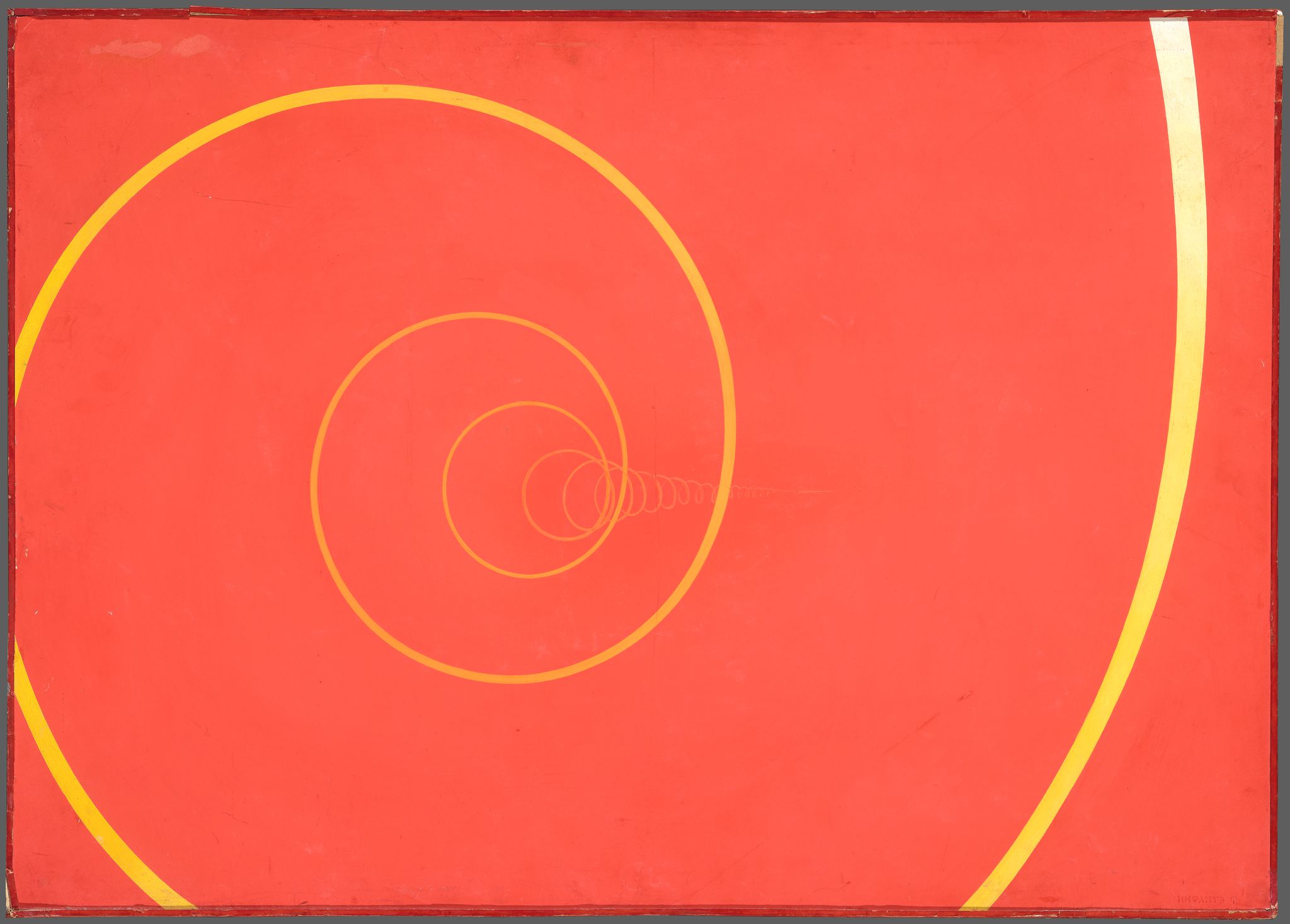
Francisco Infante-Arana (b. 1943)
Dynamic Spiral. Increasing Energy of Red Space
1964
From Dynamic Spirals series
Tempera on paper pasted on fiberboard; 55,5×75,5 cm
© Francisco Infante-Arana; State Tretyakov Gallery
2016
"Aegina", 2004 by Gleb Bogomolov has become the emblem of the Seventh International conference "Actual problems of theory and history of art".

2015
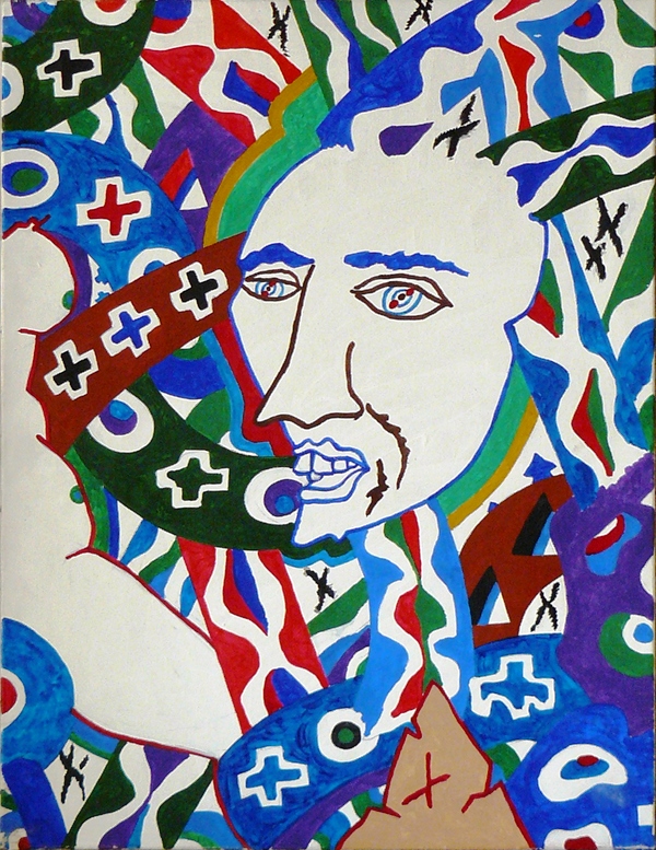
"Tondo", 2002 by Vyacheslav Mikhailov has become the emblem of the Sixth International conference "Actual problems of theory and history of art". The main topic of the 2015 conference was “Renaissance and the Art of Europe”.
![]()
Vyacheslav Mikhailov
 1945 – born in Arzgir, Stavropol region.
1977 – graduated from the Department of Painting, Repin Institute of Painting, Sculpture and Architecture in Leningrad.
1979 – completed a postgraduate course at the E. Moiseyenko studio.
1979 – became member of the Russian Union of Artists.
1993 – member of the State Artists Association of Italy, ITALART.
1999 – awarded the title of "Honoured Artist of Russia".
Vyacheslav Mikhailov had 68 personal exhibition and has participated in more than 300 shows abroad.
His works are found in the following museum collections:
- State Hermitage, St. Petersburg, Russia.
- State Tretyakov Gallery, Moscow, Russia.
- State Russian Museum, St. Petersburg, Russia.
- Modern Art Museum, Moscow, Russia.
- Erarta, Museum Contemporary Art, St. Petersburg, Russia.
- Cultural Fund of Russia, Moscow, Russia.
- All-Russian Museum of A.S. Pushkin, St. Petersburg, Russia.
- Arts Academy Museum, St. Petersburg, Russia.
- State Museum of Theater and Music, St. Petersburg, Russia.
- Manege Central Exhibition Hall, St. Petersburg, Russia.
- Fine Arts Museum of the Republic of Tatarstan, Kazan, Tatarstan.
- Museum of Russian Art, Kiev, Ukraine.
- Museum at Schmidt-Haus, Nabburg, Germany.
- Ludwig Museum, Cologne, Germany.
- Zimmerly Art Museum, New Jersey, USA.
- Museum of Soviet Unofficial Art, New York, USA.
- State Museum of International Art, Beijing, China.
- State Museum of Art, Shanghai, China.
- State Art Gallery, Mandal, Norway.
- Art Museum, Tampere, Finland.
- Kadriorg State Art Museum, Tallinn, Estonia.
A painting like version of our reality, which has nearly left our minds – this is what you can find in my works. Symbols of humans’ existence – witnesses of the long gone life.
Vyacheslav Mikhailov
Art critics about Vyacheslav Mikhailov:
Dramatic, often tragic thoughts about nature and hardships of history and contemporaneity appear in his personality, his works, paintings and exquisite drawings. This deep thinking develops itself in strong texture of his painting and expressive brushstrokes that make it look similar to frozen magma. Grotesque, which Mikhailov understands as consolidation of forms and concentration of meanings, adds even more tension to his canvases. Hardships of human life hide beyond the interaction of almost alive, flesh like colour masses, or furious contrasts of spiky lines – in myths and realities, in problems of society.
Form is constantly active, it is conceptual for Mikhailov. Form is aesthetically informative in his both figurative and abstract works: process of finding a proper way of expressiveness is not a matter of craftsmanship for Mikhailov, but it is what Rodin had said “The resemblance which the artist ought to obtain is that of the soul”.
Anatoly Dmitrienko
Vyacheslav Mikhailov admires classical art, however this does not interfere with his post-modern manner of expression; he is a realist, despite his works are mostly abstract. He possesses a sense of tradition, mainly in his works’ plots, and also a constant aspiration towards the key ideas that is encoded in complex schemes of symbols and allegories.
Olga Musakova
Mikhailov’s impeccable forms of both painting and drawing is not a result of his natural Mozart like talent, but of a hard process of finding and consolidating this hidden ontology of matter, sound of colour in its thickness and might. Airspace changes into holes in the earth bursting with magma. It is as the rage of the earth’s pressure squeezes out thick sturdy forms – products of a struggle.
Nikolai Suvorov
One might be forgiven for initially assuming that elements of the non-objective world would prevail on the artist's canvases. Large coloured planes hemmed into one another or lying on top of one another; coloured stripes with spilling edges; pieces of canvas outlined with a distinct contour and peppered with parallel strokes or jabs of the brush —they all have a non-objective essence, do not depict anything and do not imitate any objects. Doubt, however, is soon cast on such an interpretation. In the majority of cases, the compositions of the cycle evoke landscape associations. One recalls the words of Mikhaylov himself: "The process of associative feeling is the most important assignment of art." Perhaps unsurprisingly, many critics writing about Mikhaylov have mentioned the multiple significance of the images that he creates. This multiple significance is not a special undertaking or an element of artistic game. The master simply had, close at hand, constant witnesses of the surrounding reality created from the earth. Filling the artistic memory, they are determined to acquire painterly flesh. The multiple meanings are born in this abundant soil of real impressions. They are not limited to the objective world and natural situations; this also concerns the expression of more general categories and notions, such as the beauty and perfection of the simple. The most everyday and modest object is sometimes unexpectedly filled with aesthetic meaning, acquiring an archetypal essence. This is also one of the features of multiple significance. Examples of such transformations are encountered at every step, in nature and on the street.
Dmitry Sarabianov
The adept of pure form, Mikhailov strengthens and reveals colour as a miner extracts semi-precious stones from a drift. Everything comes in hand: concaves, specks of duct, knobbles. Paint covers all that and makes it precious. One gets an impression of robust beauty from his works. The flesh of his paintings arouses a trained eye, no chance to confuse it with anything else. Mikhailov is a refined colourist with firm muscles.
Anatoly Belkin
It [colour] is something different, material and unreal at the same time. It is clear that appearing before us, coming from the depths of matter, the colour changes in front of our eyes: it shimmers like semi-precious stones in a cave or like dark waters in a whirl.
Valery Turchin
Vyacheslav Mikhailov challenges himself with tasks of artistic and colour plasticity. He sees a connection with the great traditions of the past in these tasks, a sort of “recoding” of the settled tendencies that art of Italian painters of the Renaissance or Rembrandt was based on.
Marina Dzigarkhanian
In drawing he values the “instant emotional outburst” the most; in painting he fears hustle, alike the Umberto Eco’s character. Slowly, but steadily as “a conquistador in a metal armour” he goes all the way from introduction to epilogue, from corner to corner, generously and absent-mindedly dropping and mixing colours till they reach a consensus, till the image is not divided into the main and the secondary; he waits till the limit is reached and the artist’s tension has filled up the canvas with space and time and the surface of the canvas becomes as precious and out of reach as it was before he touched it.
Vladimir Lenyashin
The essential thing is the passionate relentless temper, which is, of course, notable in the context of anaemic semi-tones, parades of interpretations, remakes, cunning reticences and complex concepts – everything, what we see today not only in painting, but also in theatre, cinema and even literature. Mikhailov is not interested in all that: he works till the “absolute serious downfall” (B. Pasternak)
Mikhail German
That vivid world that the artist offers to us is ruled by harmony. Exactly the harmony we miss so often in our everyday lives. Not only the artist keeps a balance between the “two” abstractions that are more or less specific at the same time, but he is looking for harmony in everything. Peacefulness comes from every detail of his canvases, but this peacefulness is of a special sort – the calm before the storm.
Valery Turchin
This special artistic space appears in Mikhailov’s works as a result of not merely searching for the deep hidden truth of reality, but as a result of meditation in front of the Hermitage canvases by great masters of the past from Italian Renaissance to the European in the 17th century, dominated by works of Rembrandt. It is Rembrandt, who many of the Mikhailov works are devoted to. In those canvases Mikhailov reflects on Rembrandt again and again, goes back to the interpretation of reality in his constant search of the truth, which is found beyond the outward appearance of things.
Ennio Concarotti
Whether or not the artist had seen the works of his predecessors, his canvases carry echoes of the voices of both Francis Bacon and Pavel Filonov. In the drawings, these voices belong to Conrad Felixmuller and Ernst Ludwig Kirchner, although there are no direct borrowings or indications of imitation. This is more a manifestation of the memory of the art itself— increasing as a result of the short distance between the artist and the formation of these new paths. Vyacheslav Mikhaylov's experience of academic drawing did not hamper his assimilation of these innovative principles (Francis Bacon and Pavel Filonov were also trained in academic drawing). This can be regarded as the artist's first "deposit" in the "security box." The history genre — inherited from his Academy teachers and transformed by Surrealist fantasy — acquired new meaning. In certain cases, the traditional subjects remained, such as The Last Supper, Bearing the Cross, The Flagellation, The Crucifixion and St George.
Dmitry Sarabianov
2014
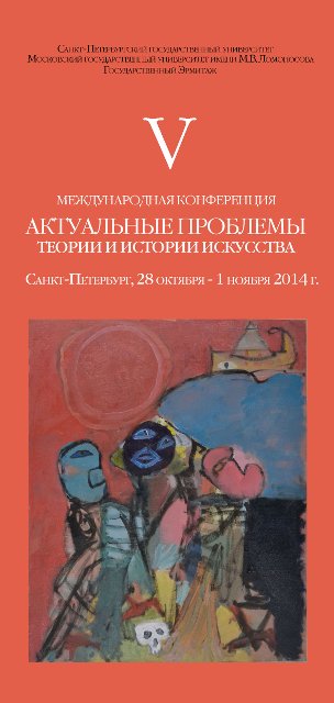
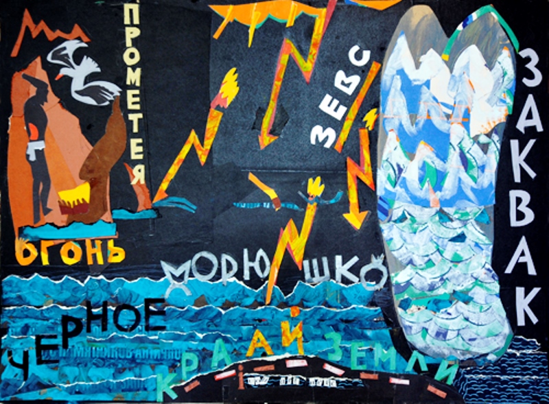
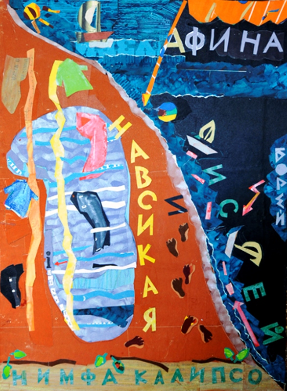
"Nessus and Deianeira", 2007 by Alexander Bikhter has become the emblem of the Fifth International conference "Actual problems of theory and history of art". The theme of the conference this year is "Images of Classical Antiquity: Classical Art and its Legacy for the World Culture".

Alexander Bihter
Born in 1951 in Leningrad, USSR. As a child studied art in Solomon Levin's studio. In 1972 graduated from Nadezda Krupskaya Institute of Culture and went on military service. After that worked in a zincographer’s shop of Ivan Fedorov printing office as an etcher.
In 1981 graduated from Vera Mukhina Higher School of Art and Design with a specialisation “artistic design” and started work as a designer at the “Plastpribor” factory. From 1983 became a member of Assocition of Experimental Art and permanent participant of its exhibitions. From 1987 to 1992 taught art to children at the “Smena” club.
Alexander Bihter’s works can be found in the collections of State Russian Museum (St. Petersburg), Museum of City History (St. Petersburg), Museum of Nonconformist Art (Pushkinskaya 10, St. Peterburg), Tsarskosel'skaya Collection Museum, Central Exhibition Hall "Manezh" (St. Petersburg), and in private collections in Russia and abroad.
From 1990s he was involved in book graphics and designed more than 10 books. In cooperation with V. Nozdrin he designed an emblem an a model for a series of “The Antiquity in Hermitage”. He had several personal exhibitions and was a member of numerous joint exhibitions including "Avant-garde at the Neva River. The second part of the XX century" in Tretyakovskaya gallery (Moscow).
Personal exhibitions
- “Norint” publishing house, St. Petersburg, 1999
- “Fishermen, wanderers, etc.” (painting of the 1990s)
- Mitki-Vkhutemas art centre, St. Petersburg, 2000
- “Watercolour, drawing, illustration – the 1990s”
- State museum “The Tsarskoe selo collection”, Pushkin, 2000
- “Painting, graphic art”, Fundus gallery, Dom kino, St. Petersburg, 2001
- “Yearly motives” (drawings made in 2001, but themes based on previous works)
- The “Zazerkalie” theatre, St. Petersburg, 2002
- “Letokhod” (new drawings), Mitki-Vkhutemas art centre, 2002
- “Recent painting”, IMISP (International Management Institute St. Petersburg), 2003
- “PeeMZhe. Pastel, oil painting”, Museum of non-conformist art, Pushkinskaya 10, St. Petersburg, 2003
- “Big plein-air” (graphics), Antique and old book shop “On Liteiny”, 2004
- “Painting, graphics”, Polikor office, 2006
- “Painting”, SDM bank, St. Petersburg branch, 2006
- “Painting”, ART re.FLEX Gallery, 2007
- “Nu i Nu ”, ART object gallery, St. Petersburg, 2010
- “Graphics”, ART object gallery, St. Petersburg, 2010
- “Zgara-amba”, Borey gallery, 10х15 gallery, 2011
- “ChKKG”, painting, computer graphics, Novgorod, The State Museum of Arts and Culture of Novgorod Land, Desyatinny monastery, 2011
- “ChMOK…” (What can you expect, when…), painting, ART object gallery, St. Petersburg, 2010
- “Small chops”, painting, ART object gallery, St. Petersburg, 2014
My antiquity
![]() My father is reading Myths of Ancient Greece, the one about Hercules… Book illustrations, made by some artist called Rudakov, are black and white and are a bit dark, as if the story had taken place in a dimly lit cupboard. It is obvious from the very first glance that that story happened long time ago. Falling asleep, I hear a rustling sound of a snake moving under my bed. It gives me goosebumps, now in a second…
My father is reading Myths of Ancient Greece, the one about Hercules… Book illustrations, made by some artist called Rudakov, are black and white and are a bit dark, as if the story had taken place in a dimly lit cupboard. It is obvious from the very first glance that that story happened long time ago. Falling asleep, I hear a rustling sound of a snake moving under my bed. It gives me goosebumps, now in a second…
It has been long since I took great interest in two identical and quite thick volumes of medium size that I found in our home library. They turned out to be “Iliada” and “Odyssey”, published by “Academia”. They both contained a photo of a bust of Homer straight and profile. You only needed one glance on the photo to get an idea of how those ancient Greeks looked like. There was another book, which I could not even lift, another “Odyssey”, published by the Devryen editions. Illustrations there were also black and white, made in a fake classical manner. However, some of them were ridiculously painted over (and became livelier) in watercolour by my father’s elder brother. How did he even dare? This was such an expensive book! I also liked “Battle between mice and frogs”, its hardly speakable title of BATRACHOMYOMACHIA itself, and its design by Alice Poret. It was not clear to me, where all those beautiful plots came from and where their origins were. I noticed that some of the mythological characters and objects had obvious similarities with those of Russian fairytales: Polyphemus and Verlioka, Ariadne's thread and the magical hank of baba Yaga, Apples of the Hesperides and apples of the youth, etc. What happened before that though? The first source went as far as the Battle between Cosmos and Chaos, between the Gods and the Titans. It was only known who was the first tailor, but only there, where the echo lived, as for example in our well-like yard.
Little by little, my room, where I grew up, got stuffed by mythological characters. The corner, in which we usually put bedding clothes, turned to become Olympus and deep sighs came from there at the end of the day. Those were sighs of Moiras or Parkas that spinned their (and mine as well!) lives. At first the alternation of Greek and Roman names confused me a lot: Gods and Heroes were exactly the same. However, soon I learned to recognise two antiquities: the difference between Greece and Rome was way too obvious. Greece seemed something like a legendary Kitezh town, but gone somewhere under the skin, not under water as the Kitezh did; Greece seemed a Golden age of freedom and harmony. Rome, on the other hand, would get all over you as soon as you stepped outside. The city itself looked like a puzzle that was made of both Roman and Greek details. Thus, in the city centre there was a Greek temple, decorated with a statue of Poseidon and sea gods. At night allegoric figures of rivers rolled granite balls down the ramps (I really saw it in my dream). On the other side of the Neva river there were architectural ensembles by Rossi, inspired by architecture of the Roman Empire. Kolomna, where I had lived as a child, looked like a rural Greek province with its small houses and sense of calmness and cosiness. The same principle applies to the history of our dearest Motherland: “the beautiful beginning of the Alexander’s rule” became a predecessor of the Nicholas I time, as well as The Silver Age preceded the Soviet epoch.
At home I had dusty piles of “Apollo” and “Golden Fleece” magazines that created an image of neither Petersburg, nor Leningrad, but gloomy Petropol, where Proserpina took over the Emperor and all the Romanov family. It was an Elysium like city with white nights and shadowless figures. Although I could see the dark side of this transformation: eternal power of Fate over people and gods and absence of freedom of choice. Orpheus killed by the bacchae and the death of Socrates added a drop of bitterness to that mythological pompousness.
Eventually I got used to that sort of game, in which I would recognise faces and events, times and places as I would recognise different features of Greece and Rome. It was not an easy game, I have to say. I feel that these two antiquities live along in myself as well and I favour one or another at different times of my life. However, I can sort of calculate this predominance of one upon another in percent. For example, icon painting definitely possesses Greek features, whereas academic painting is totally Roman. Mozart, indeed, belongs to Greece, but Beethoven is a harder case, he brings both Greece and Rome together. Speaking of our contemporaries, the same thing: Richard Vasmi belongs to Greece, but Alexander Arefyev to Rome.
Going back to one of the misunderstandings of the late ancient time that has become a popular myth, we breathe in deeply and shout out to the ether:
“Great Pan died!” However, the myth about ancient Greece as a continuum of inner freedom is alive and I like it. Roald Mandelshtam, the poet from the Arefyev circle, wrote: “… It was Hellas time on Earth, it was Hellas.” Let us replace “was” with “is”.
Alexander Bikhter 03.02.2014

Igor Churilov
Igor Churilov is a painter, a graphic artist and a teacher. He was born in 1959. He is a member of Russian Union of Artists and International Association of Pastel Painters (ASPAS). In 1986 he graduated from the Department of Experimental Design, Vera Mukhina Leningrad Higher Art and Industrial Academy. From 1979 he has participated in more than 150 exhibitions, including international shows. He started his teaching career in 1983: he taught preschool children. From 1985 he has worked at the Petrogradsky Youth Art Palace. In 1992-1993 he lectured at Herzen State Pedagogical university; in 2003-2006 he run a module on painting at Institute of Television, Business and Design.
Igor Churilov is the founder and the leader of the "Heritage" group, an informal artistic association of young artists.
His works can be found in the following museum collections:
-
State Museum of the History of St. Petersburg
-
Arkhangelsk State Museum of Fine Arts
-
Manezh Central Exhibition Hall, St. Petersburg
-
The Tsarskoe Selo Collection, Museum of contemporary art, Pushkin, St. Petersburg
-
Kramskoi museum, Voronezh
-
Radishchev State Art museum, Saratov
-
Erzi Fine Arts museum, Republic of Mordovia, Saransk
Personal exhibitions:
-
1995 - City sculpture museum, St. Petersburg
-
1998 - "Petersburg unofficial", St. Petersburg Printing museum
-
1999 - "A bit higher than roof, a bit lower than sky", State Museum of the History of St. Petersburg
-
2002 - "St. Petersburg unofficial", Astrosoft gallery, St. Petersburg
-
2003 - "To the 300th anniversary of St. Petersburg", International centre, Grenoble, France
-
2008 - "Angle of vision": "Polikor", the Mitki museum, the Glass gallery, Russian-German meeting centre (St. Peter church), St. Petersburg
-
2011 - "Spaces in tune: the Volga and the Neva": Radishchev State Art museum, Saratov
-
2012 - "Wall and dome": Lomonosov gallery, St. Petersburg
-
2013 - "Natural habitat": Books and coffee art club, St. Petersburg
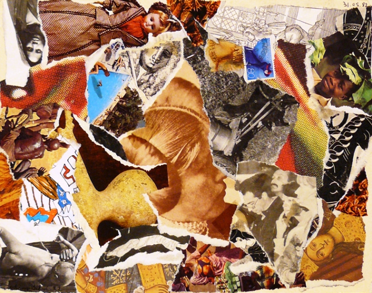
“Images of Classical Antiquity – Images of the Childhood of Humanity”
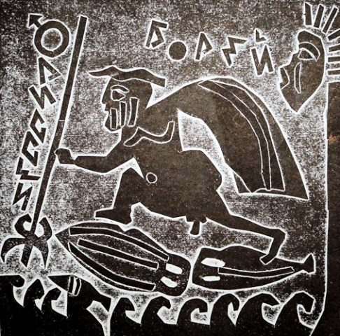
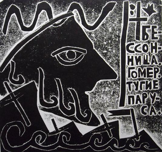
“Insomnia. Homer. Taut sails…”, these lines from the Osip Mandelshtam’s poem define the main theme of Igor Churilov’s series of collages and prints, which he made in the 1980-1990s: sea travels of Greek heroes.
Homer’s personality brings together different heroes of the Ancient Greek epos: cunning Odyssey and fearless Jason are both brave travellers. Stories of their journeys inspired artists for centuries; and every artist tried to find his own expressive methods and elaborate a specific figurative language that would allow him to dive into that journey from extreme sailing to returning home safe and sound side by side to his heroes.
Temporal remoteness and relative nature of mythological events allow artists, on the one hand, to abstract away from details and use language of symbols. On the other hand, if Classical Antiquity is no be named the "Childhood of Humanity", the use of such techniques as naive, children like drawings, seems logical. "A man cannot become a child again, or he becomes childish" said currently unpopular Karl Max. To colour, cut and glue together colourful bits of paper – isn't this fun? Even the Black Sea (Pont Euxin) turns almost black, whereas wandering heroes blend in in a grandiose "decoration" of nature, as if they were watched by almighty gods from Olympus. This was how the triptych of collages dedicated to the Argonauts sail in their quest of the Golden Fleece to Kolchis via the rock, which the titan Prometheus was chained to, appeared. The central part of the triptych shows the wanderings of Odyssey; the composition brings together a few story lines and events tha happened at different times: time flows from the bottom up and the sailing goes along - the tsar of Ithaca gets constant help from women and goddesses. Text explanations refer us to authentic texts of Classical Antiquity, they make the narrative clear, who travelled and where he or she travelled to and that clarification defines the geography of the plots.
Two matrix prints are very laconic: black and white, full of symbols and signs. They are highly expressive and made with the minimal use of details: tight sails, a “list” of ships and divine foam on the heads of the kings – all on the move as if one is asking “where are you sailing to?” Odyssey, bare, wrapped in Leucothea veilis escaping from a broken rift; Boreas, who is blowing his cheeks out, is helping him out at the behest of Athena.
This method of half-humorous, half-ironic interpretation of legendary plots, chosen by Igor Churilov, was quite popular in art of St. Petersburg in the last third of the 20thcentury: postmodernism did not yet overflow the fragile ship of culture, did not yet stuff art spaces of St. Petersburg with repeating cover-shows, aggressive quotes and loud cries.
Lines written by another poet, Joseph Brodsky, sound over this every day hustle as a saving truth:
I fall down to the river, that flows endlessly before our eyes
Through ages, right into us, past us, beyond us.
Elena Churilova, member of Association of Art Critics (AIC)

2013

Igor Gurovich
Igor Gurovich is one of the iconic figures of Russian design scene. He became famous after his series of posters for the DOM Culture Centre. Along with his friends and colleagues he designed a new type of concert and festival poster, which seems to have become a sample for a concert poster. Igor Gurovich also makes designs for furniture, scenography, environmental design, fashion etc. He tries to personify his every work.
"Categories of warm-hearted, good, tender can not be applied to design as a profession. This is not right ” – says Igor Gurovich – “We have a secret intention to bring this category back in design, because being a designer means being an artist.” He also says that “design is one of the few professions that can make a man happy”.
Igor Gurovich was born in 1967 in Riga. He graduated from Moscow Stroganov Higher Industrial Arts School and worked at IMA-press publishing as a creative director in 1995-2002. In 2002 along with Eric Beloysov and Anna Naumova he founded the «Оstengruppe» studio, followed by the “Zoloto” studio in 2008. He was always a source of inspiration and a team leader in all his undertakings.
“When I rise back up from moths of hard work, when I don’t see my family, my friends, my children, I don’t even see daylight, I ask myself a question, I can’t find an answer to: “What is it all for?” Then, out of nowhere, I have realised that I am making my own book, which people will remember me by after my death. I want my book to be precious, elegant and to contain many decent works. I believe it is the only thing I want. I understand that probably it is not a right sort of aim forming (determination), but it is as it is. As soon as living and working means the same to me and I have deliberately chosen this path, all the rest becomes relatively small and unimportant.”
2012
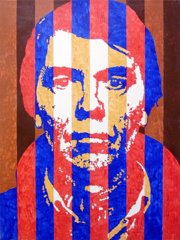
The Third conference has chosen a picture “Escape to St.Petersburg” by Vik its emblem in 2012.

Vyacheslav “Vik” Zabelin is a Russian painter and a poet
He was born on October 29, 1953 in Mongolia, near the mountain where according to the legend Changis-khan has been buried. His father was an officer at the military. As a child, he started to learn painting; later on, he received his education at Serov art-college in Leningrad. At first, he worked as a restorer in Peterhoff museum. At the theatres of Leningrad, he worked as a stage properties painter. His artistic career in Russia and abroad got its start in the beginning of the 70’s, when he founded “Alypius” creative teamwork and became one of the founders a new artistic group called the Fellowship of Experimental Visual Arts. In the 80’s, Vik took an active part in organizing first Petersburg modern-art galleries: “Anna”, Art-collegium”, “Ariadna”, “Inkom-bank gallery”, and so on. Vik is a member of the international Fellowship of Liberal Culture, Saint Petersburg Union of artists and the Association of Russian painters in Paris. He also is a creator and a coordinator of international art-projects such as “The Collection”, “Measure of All Things” and “Palette of Consonance”. His works are presented at various museums and art-galleries around the world.
There is a very special relationship between Vik and the Department of Art History at Saint Petersburg State University. Every year freshman students, future art-historians, receive a unique opportunity to visit Vik’s own art studio, look at his new works and learn a few things about the creative process. Thanks to Vik, our students from Russian and Western European art departments are always among special guests at different art shows and fairs, which is very important for the students who specialize in modern art.
The Unsaid Formula of Saint Petersburg
Vik’s creative work is a significant, original phenomenon in the cultural life of modern Saint Petersburg; it is untraditional and enigmatic just like the fate of the Northern capital and an amazing aura of the city. The depth of a heart and soul of a person faced with everyday moral choices and questioning the meaning of his existence are reflected here like in a mirror. It is not a coincident that the author uses an expressive language of ancient Russian art. It allows him to see everyday themes and images under a completely different angle which lacks any religious constituents. Even a traditional iconography of his paintings we interpret as a very personal feature that reveals us an emotional inner world of the artist. Certainly, there is an influence of the 20th century Russian avant-garde, the period that rediscovers the artistic legacy of the pre-Petrine Rus’ and different forms of folk art including popular prints. This allows Vik to combine in one field several artistic periods – before and after Peter the Great, who opened a new chapter in the history of our nation.
Probably it is not a coincident that the master is fascinated with an image of Dostoevsky, who, if one may call so, tied together in his famous works the past, the present and the future of Russia, raised complicated and painful questions, revealed antagonisms of our society. Vik never gives a single-valued assessment of Dostoevsky as a person, or his characters. In “Formula of Dostoevsky”, he depicts two faces the writer, whose spiritual and moral perturbations gain flash and carry us away through the looking glass of his life. Vik’s images resonate with the dialogue of the human spirit discovered by Dostoevsky. The city appears before us as a theatrical stage where the human drama of Dostoevsky’s characters and real people takes place. In a way, Vik’s own immediate life impressions are the necessary basis of his most important works.
Vik’s paintings are filled with different symbols that originate from the Early Christian tradition and practices of other religions and cultures. They interfere with ordinary cityscapes filling up the space of Neva embankment (“Spheres in crosses”), appearing in the interiors of the churches, market places, or even inside of apartments. It looks like the order of things exists due to some kind of mechanism that admits a combination of geometrical forms and symbols into our world. Vik sometimes deliberately exaggerates the size of those figures in order to make his paintings look more monumental when it matches his original intention. We can observe this sort of scale in the depiction of the Kuzhnechny market regulars.
There is a sense of standing on the edge dividing the Good and the Evil, Man and Woman, Heaven and Hell, the East and the West when you look at Vik’s works, and this edge is the city itself. There are strong religious motifs in his triptych called “The keepers of Petersburg”, where the artist depicts Xenia of Petersburg and other city saints. Vik is not afraid to use the techniques of Old Rus’ art and to mix it with modern western techniques thus creating his own unique, acclaimed by critics style of painting.
Ruslan Bakhtiyarov,
PhD, the State Russian Museum
2011
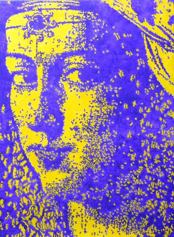
"Acme", 2005 by Egor Koshelev has become the emblem of the Second International conference "Actual problems of theory and history of art".
2010
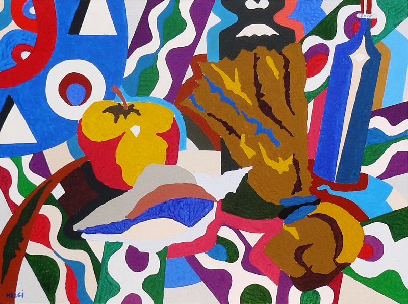
"Soleil (The Sun)” is a painting by Oleg-Helgi Liagatchev (oil on canvas, 130 x 97, 2010, private collection, France) that became an emblem of our first “The Actual Problems of History and Theory of Art” conference.
. Lyagachev")
The idea of the painting is to show the author’s reflection on the nature of creativity. On the opening session, Mr. Liagatchev said, “The theme of the sun has always attracted me as an artist. I present the sun here as a source of energy, an initial cause of genesis and therefore the cause of life and self-consciousness. From chaos to thoughts, to the awareness, to complex systems, to creativeness… The search for an absolute in art expresses itself through an emotion. An emotion in painting just like in writing is born at the time when a stylos touches a support. As a result, we have an image or a painted symbol – a major contribution to the art of painting. A stylos and a support in contemporary art have different faces, but the essence of painting is vision, it is an art for your eyes, and through your eyes it gets further in to your consciousness which didn’t evolved too far from the primeval art of the caves of Lasko. Nowadays, we, only with greater audacity, touch a surface with a stylos, and symbols appearing there become more personal. They contain in its structure a presence of an artist.
Oleg-Helgi (Oleg Alexandrovich) Liagatchev
Oleg-Helgi (Oleg Alexandrovich) Liagatchev, born 1939, is an artist, an art theoretician and a writer (under the pen name Helgi-Lughin). He graduated from the Leningrad Institute of Painting, Sculpture and Architecture in 1966. From 1967 to 1979, he was a member of “Petersburg” art-group along with M. Chemiakin, E. Esaulenko, V. Ivanov, A. Vasilyev and others. Oleg-Helgi presently lives in Paris where he moved in 1975.
Artistic career periods:
- “Semiotic” (1968 - 1985)
- “Expressionistic” (1985 - 1989)
- “Abstract classicism” (1995 - 2004)
- “The new synthesis” (2004 – present)
Liagatchev belongs to the generation of “the sixties” – a very important period in cultural life of Russia. The artist was growing up in the atmosphere of an unbridled pursuit of knowledge of existence by both scientific and spiritual means, discussions between “physicists and lyricists”. As a university student, he was deeply interested in emotionalism and expressionism in painting.
His artistic experiments, including the ones where he mixed tempera with sand, combined with his professional attitude of an art historian. He was deeply influenced with the art collection of Hermitage, where he, along with other young artists such as M. Chemiakin, V. Ovchinnikov, V. Uflyand and V. Kravchenko, worked as a technical staff in order to get an opportunity to actually see and “feel” original paintings of the highest quality. In 1964, these artists, including Liagatchev himself, took part in an underground art show called “The exhibition of worker-artists of Hermitage Utility Department dedicated to the 200th anniversary of Hermitage”, which was one of the first unofficial, prohibited by the authorities art exhibitions in the Soviet Union.
The name “Petersburg” was chosen by the members of the group as an opposition to the official art of soviet Leningrad. Rebellious spirit and fascination with the Decadent movement were the distinguishable features of their works. Lyagachev was always a part of Chemiakin’s masquerade performances, but in time, he developed his own so-called “semiotic” artistic method. “The «Petersburg» Art-group Manifesto” was written in 1967; it was signed by Chemiakin, Liagatchev, Esaulenko and V. Ivanov as a testimony of solidarity in their views.
Liagatchev’s early “semiotic” works, displayed during underground exhibitions in” D/K Gaza” and “D/K Nevsky” cultural centers in 1975 and two years later at Venice and Turin Biennales, had a great success. His other “semiotic” works were presented at his personal exhibitions in Paris, Leon and during “Russian non-conformism” exhibition in London, New York, Vienna and Tokyo. During his work in France, the painter started to use different materials that gradually led him to the development of his “semiotic” method, where the pictorial order combines with an elaborate system of coded signs and creates a complex relationship inside the structure of his paintings. Living in Paris, Liagatchev quickly became a part of French artistic life; he was involved in a number of artistic projects as a Parisian painter. During the 80’s the painter turned to collage techniques and neo-expressionism, his coloration scale became more and more brightened up and refined.
In the 90th, the artist actively works and exhibits his paintings at numerous art-shows both in Paris and in St. Petersburg. His personal exhibitions were held at various art-galleries of our city such as “Borey”, “Art-center”, “Pushkinskaya 10”, and so on. During that period, which he named “abstract classicism”, the artist attempted to give a new interpretation of the classical heritage and to create a new study of the Old Masters’ paintings. Being an artist and at the same time a professional art criticist, Liagatchev constantly scrutinizes his own paintings. In his latest works, he mixes different graphic and painting techniques calling his latest artistic style “the new synthesis”, where he uses picturesque components alongside with cryptograms and texts.
Ekaterina Stanyukovich-Denisova